Lead with the tilt
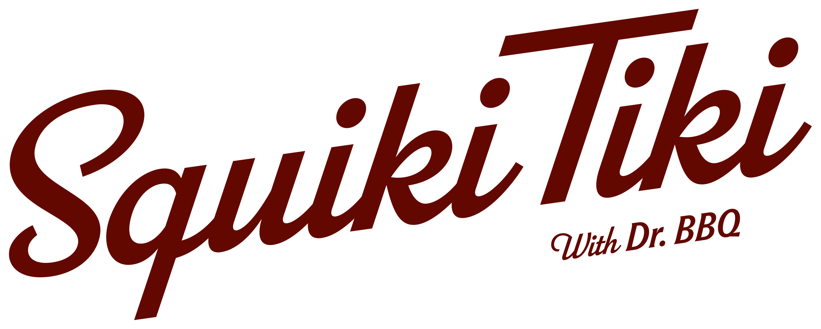
Use the angled signature as the primary expression across signage, menus, campaigns, and high-impact moments.

Squiki Tiki Brand Guidelines
EST. 202601 / Identity
Our logo leads with the same swagger as the bar itself: compact, spirited, and tipsy just enough to feel alive.
Use the angled signature as the primary expression across signage, menus, campaigns, and high-impact moments.
Keep clear space equal to the height of the lowercase “i” on every side. Let the mark breathe.
Use the full wordmark at 120 px or wider on screen. Below that, switch to the stacked icon.
02 / Brand system
Three lockups cover the full range of brand moments. Choose for the available space, never for novelty.

The hero mark. Use for expressive placements and brand-first moments. Available with or without “With Dr. BBQ.”

Use when a level baseline improves fit or readability: web headers, narrow signs, and sponsor rows. Tagline is optional.

Reserved for avatars, favicons, stickers, stamps, and compact placements. Never add “With Dr. BBQ.”
03 / Brand system
Consistency keeps the signature recognizable. Use approved artwork and resist the urge to “improve” its personality.
The primary artwork already has the right angle.
Scale proportionally. Never squeeze or widen.
Use a solid, approved brand color only.
No shadows, glows, gradients, or bevels.
Keep every lockup inside the approved system.
 WITH DR. BBQ
The stacked icon never carries the endorsement.
04 / Brand system
A sunbaked spectrum with enough heat for a tiny room and enough depth for a long night. Sand is the core canvas; Lava Rock anchors; Fire delivers the signature hit.
05 / Brand system
Three voices give the system its range: a condensed display face for impact, a relaxed script for flare, and Manrope for clear everyday reading.
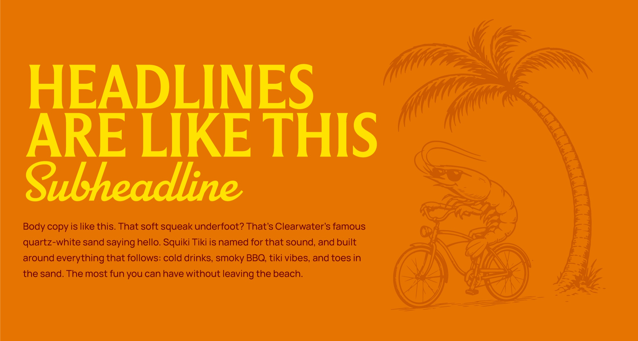
Use uppercase for short, high-impact messages and section titles.

Parkside Regular. Use sparingly for warm asides, punchlines, and expressive accents.
Use for paragraphs, captions, navigation, specifications, and utility text.
06 / Brand system
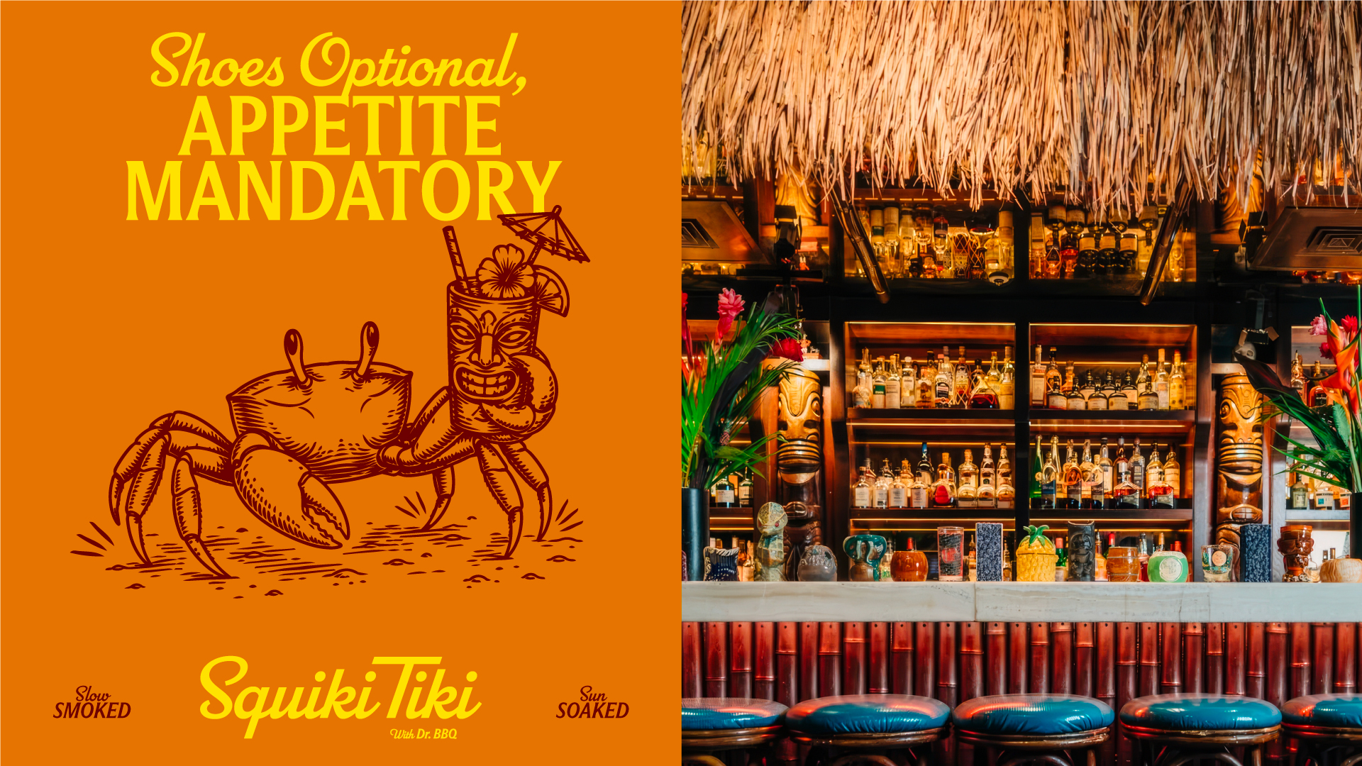
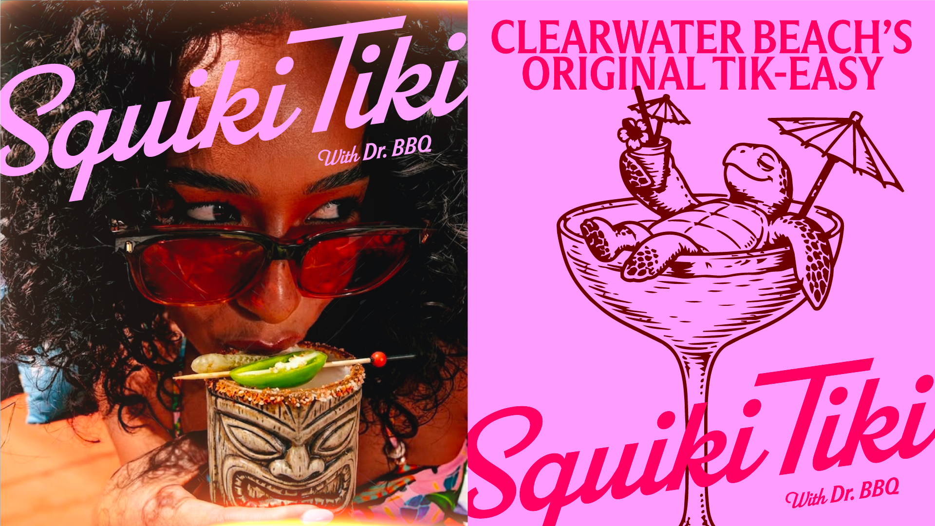
Make the place feel close enough to touch. Photograph people, pours, plates, and the packed little world around them with heat, humor, and human energy.
Crops can be tight and tactile. Prioritize gestures, garnishes, hands, faces, and the textures of the room.
Use warm, saturated light with bold reds, oranges, greens, and electric accents. Avoid cool, washed-out neutrality.
Favor candid action, eye contact, small surprises, and a little imperfection over polished hospitality clichés.
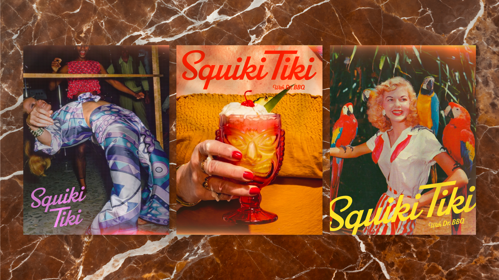
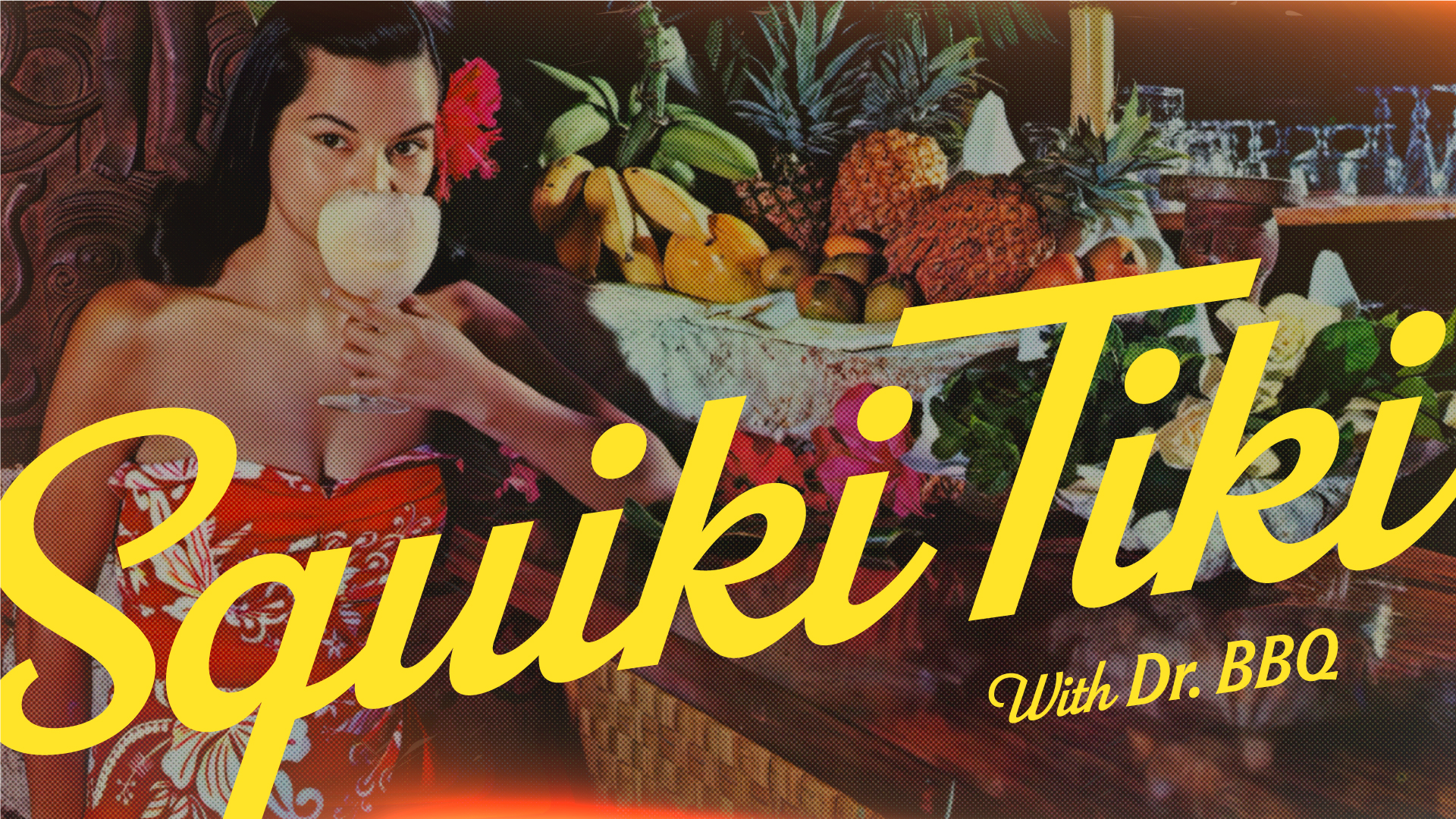
Vintage tropical photography is a distinct pillar of the system. Use it to add nostalgia, wit, and a sense of found ephemera.
Pair photography with tactile patterns: carved palm, bamboo, wood grain, marble, and woven surfaces. Crop close enough to feel physical.
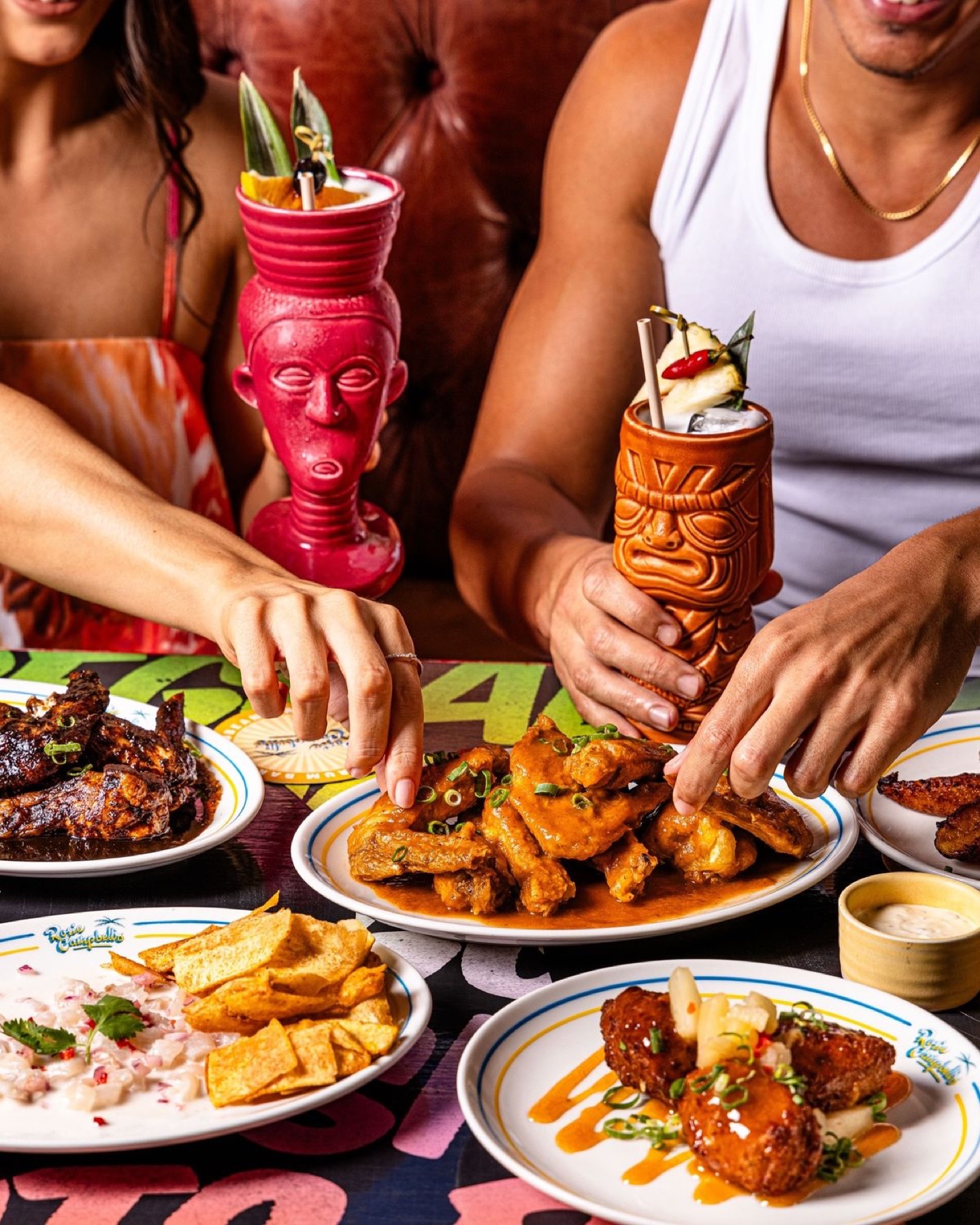
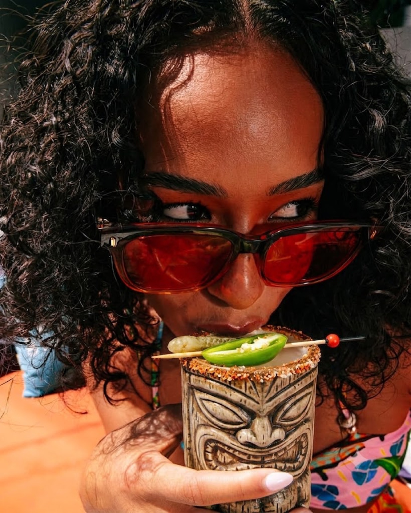
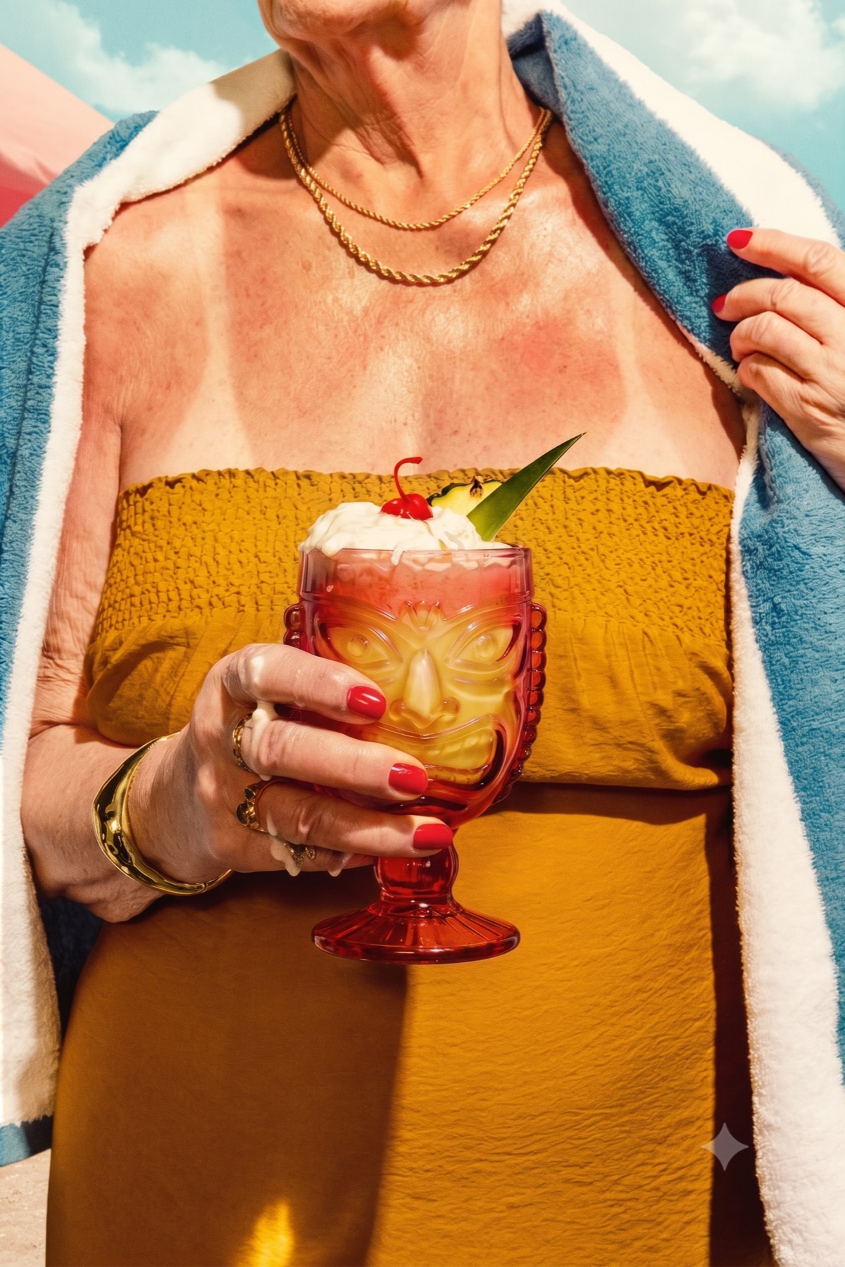
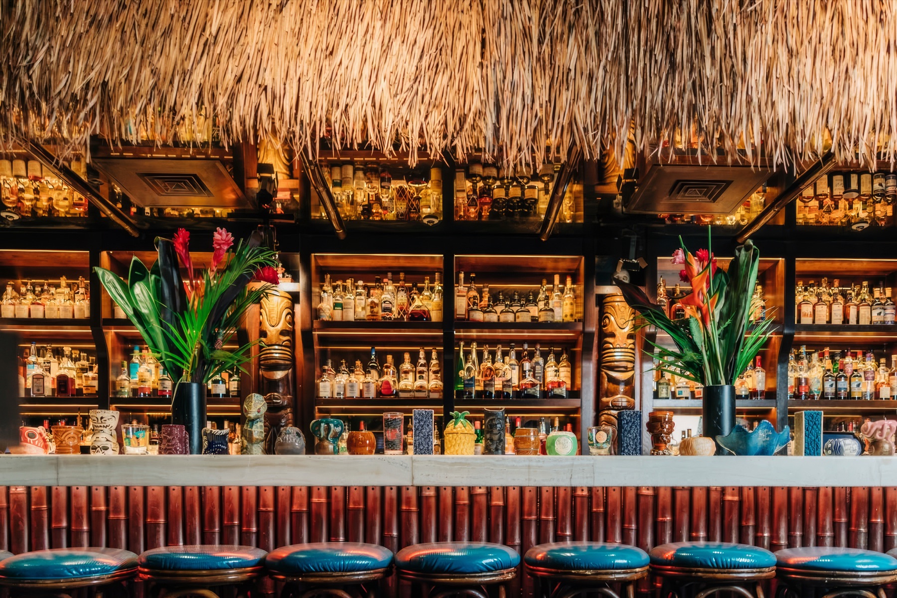
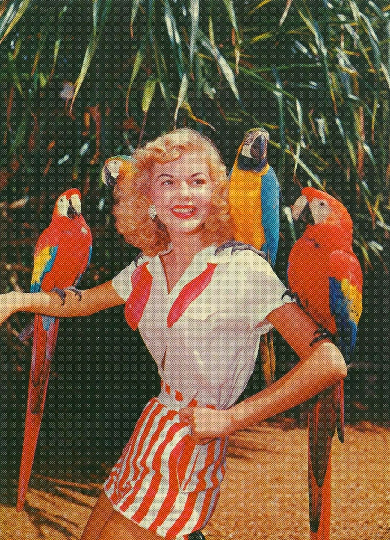
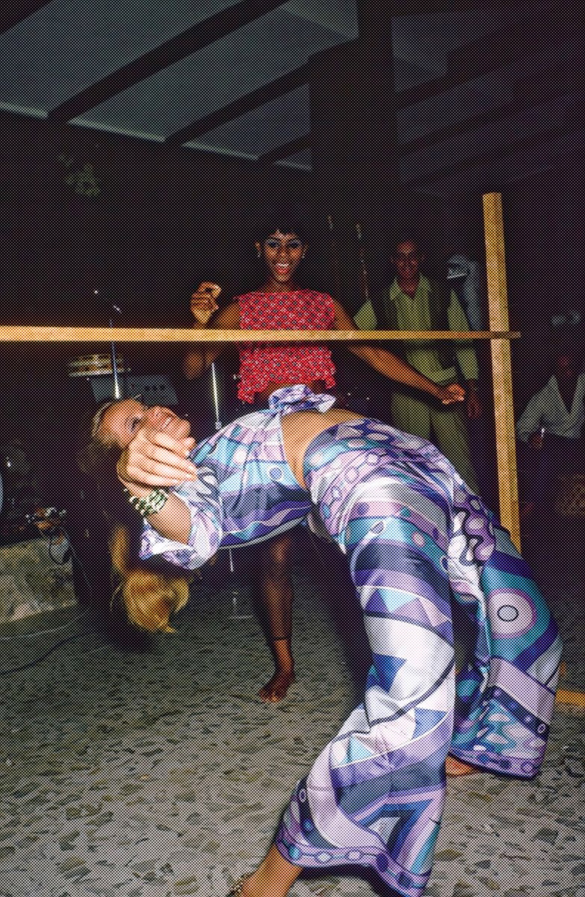
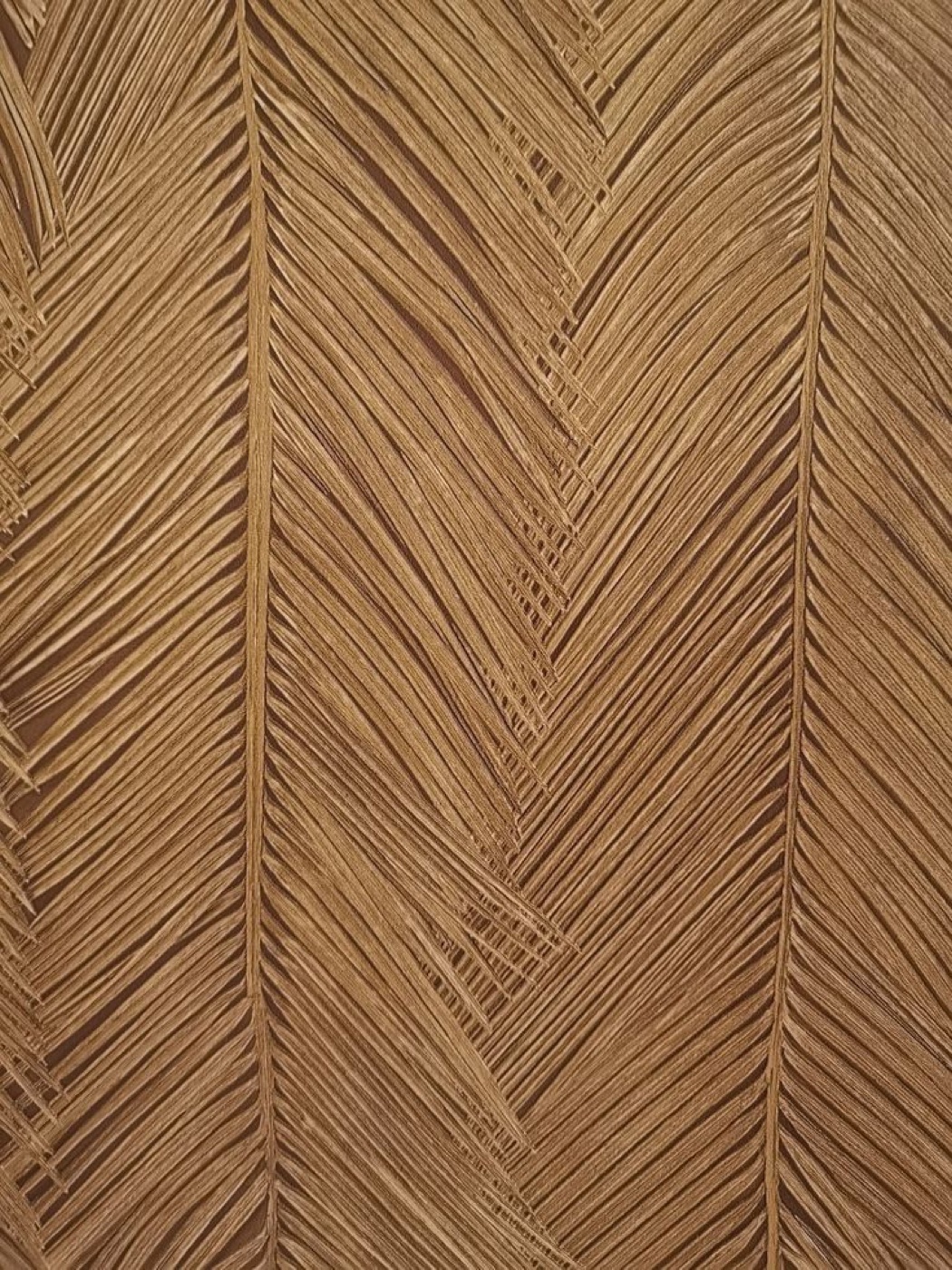

Flash-forward nightlife meets vintage tropical print.
Bold color · direct light · lived-in material · playful crops · graphic pattern · food and drink in motion07 / Brand system
A halftone layer connects vintage photography to the tactile, printed character of the brand. Apply this pattern only to vintage photos; contemporary imagery stays clean.
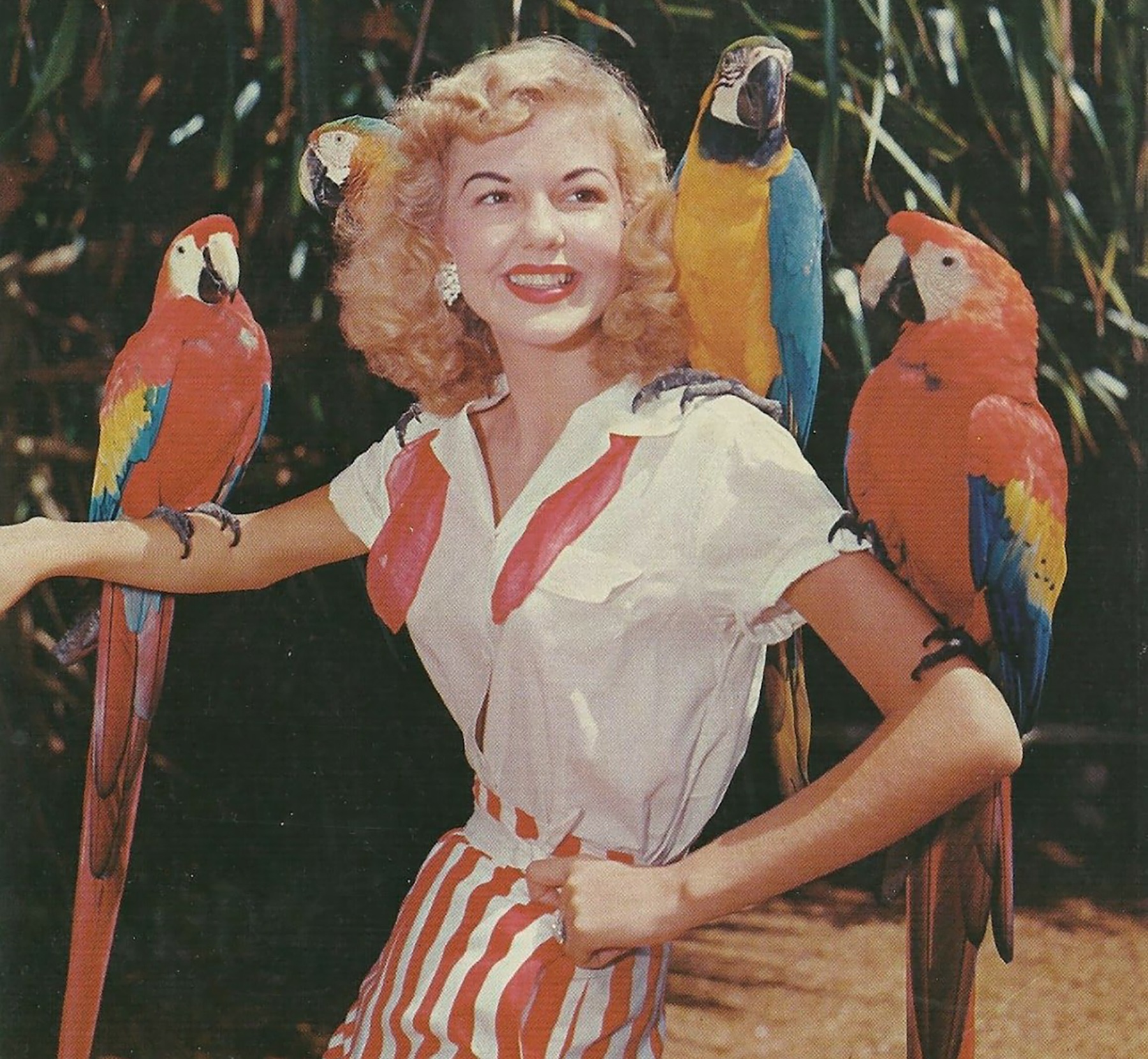
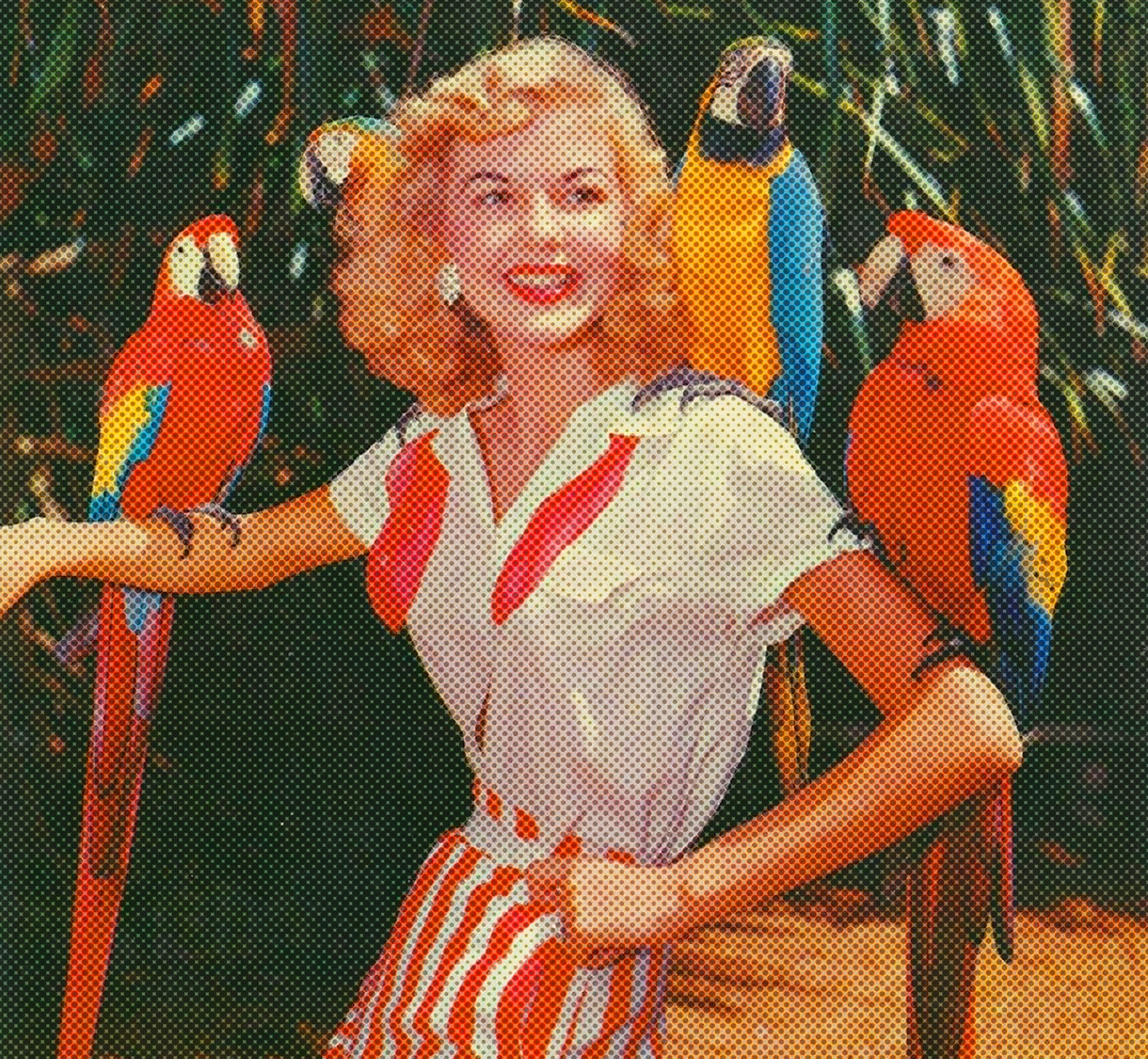
Use the halftone pattern only on vintage photography. Keep faces and key details recognizable, and never apply it to contemporary people, food, drink, or interior photography.
08 / Brand system
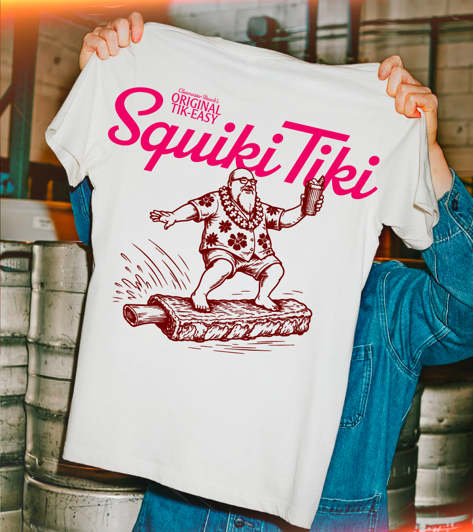
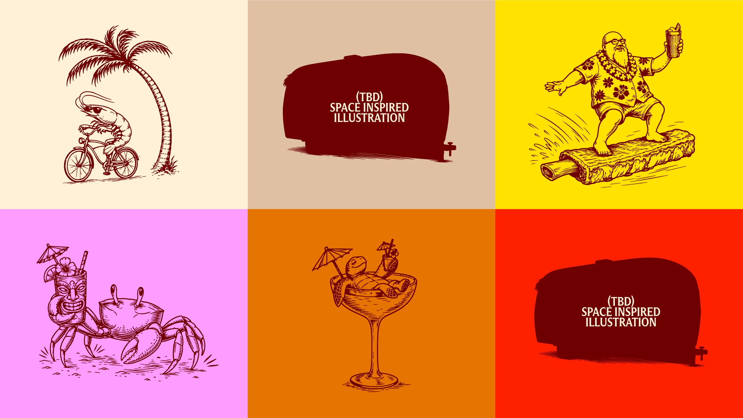
The illustration world is still in development. Illustration linework is always Lava Rock and may sit on any of the approved background colors shown here.
09 / Brand system
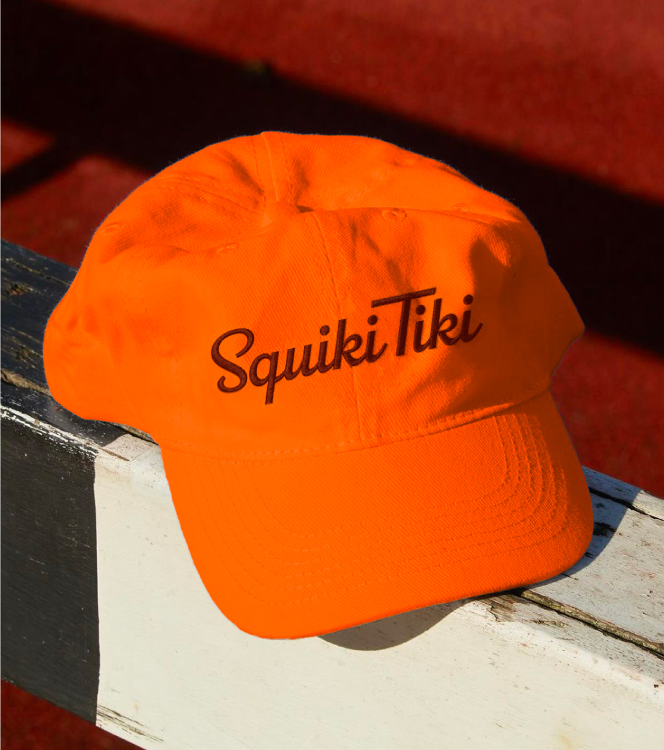
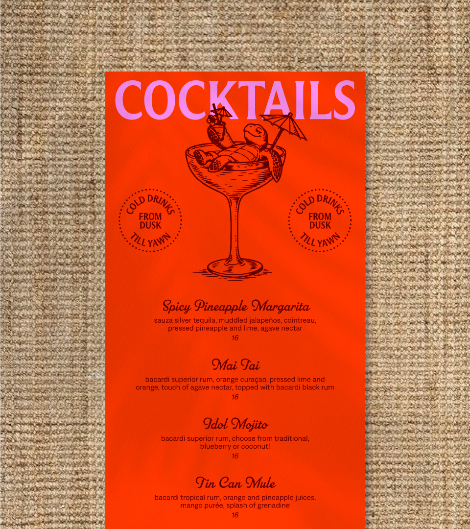
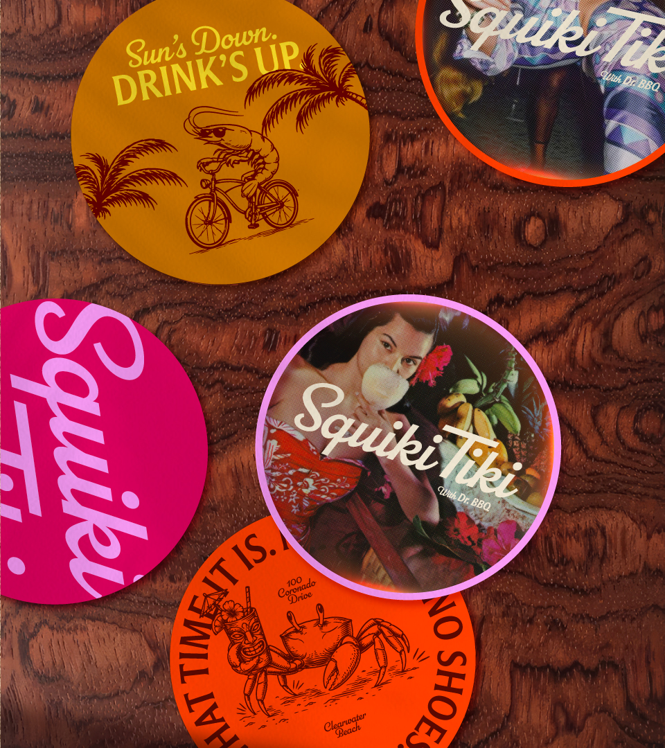
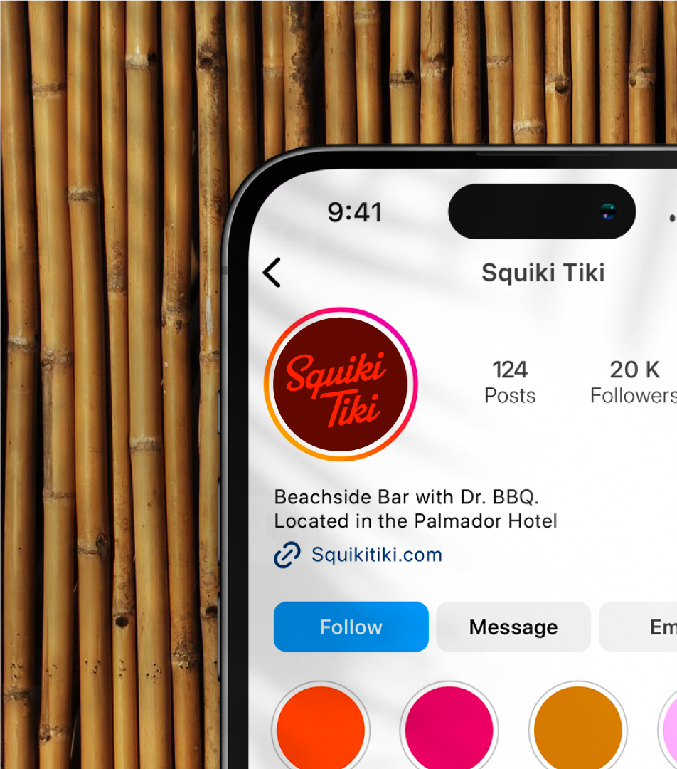
These examples show the system coming together across campaign, social, apparel, menus, coasters, and environmental moments.